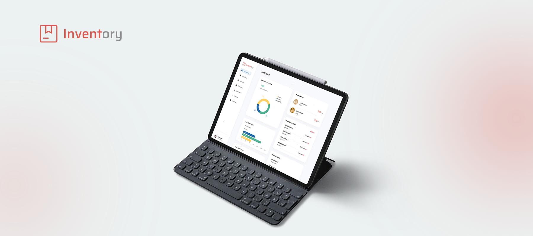
Inventory Dashboard.
A comprehensive B2B dashboard redesign that centralizes inventory tracking, production workflows, and distribution metrics. The new system replaces fragmented spreadsheets with a visual, intuitive interface—reducing cognitive load for factory floor managers and significantly cutting data entry errors.
The Problem
Fragmented systems leading to costly fulfillment delays.
Jadbery's factory floor managers were relying on three different legacy systems and physical spreadsheets to track raw materials and final product stock. This disconnect caused a 25% error rate in daily inventory logs, leading to over-purchasing of raw materials and delayed fulfillment times.
Core Objectives
- ✓Unify inventory and production tracking into a single source of truth.
- ✓Reduce onboarding time for new factory floor managers.
- ✓Provide real-time low-stock alerts to the purchasing department.
Research & Discovery
Understanding the Factory Floor Reality
We started by shadowing shift managers during their daily routines. We discovered that speed and visibility were paramount. Managers couldn't afford to click through 4 layers of menus just to log a batch completion.
Speed over Aesthetics
Users needed high-contrast, immediately readable data. Subtle gray text was useless under factory lighting.
The Tablet is King
90% of data entry happened on iPads carried around the warehouse, making touch-friendly targets crucial.
Status Paralysis
Users couldn't quickly tell if a batch was delayed due to missing ingredients or machine failure without calling someone.
User Personas
David, Warehouse Supervisor
"I just need to know what's running out today so the lines don't stop tomorrow."
Pain Points
- •Hates manual data entry.
- •Frustrated by system timeouts.
- •Needs a high-level overview of critical shortages.
Sarah, Logistics Coordinator
"If the warehouse numbers are wrong, my delivery schedules are ruined."
Pain Points
- •Wastes 2 hours a day cross-referencing spreadsheets.
- •Misses urgent dispatch windows due to delayed updates.
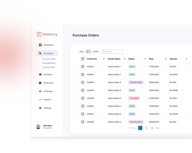
Ideation
Mapping the New Workflow
We completely restructured the Information Architecture (IA). Instead of organizing by 'Department', we organized by 'Action State' (E.g., Needs Attention, In Production, Ready to Ship). We then moved into low-fidelity wireframing to test these concepts quickly with David and his team.
High Fidelity Design
Designing for Clarity and Speed
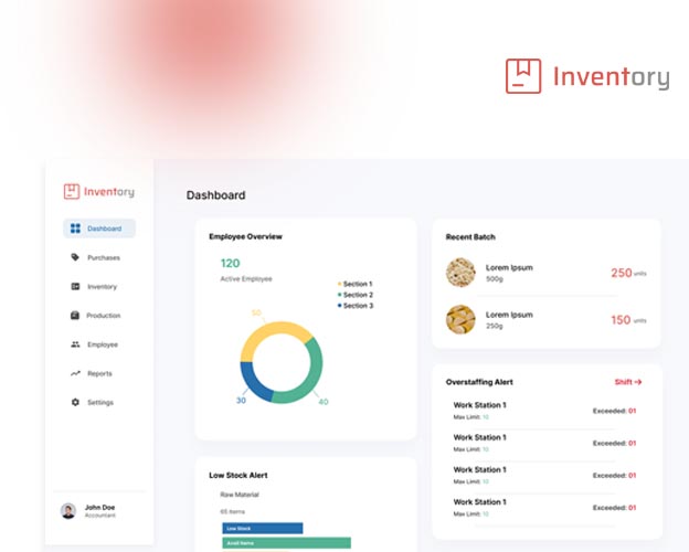
Moving into High-Fidelity, the focus shifted to a robust design system. We implemented a strict color-coding standard: Red for urgent low-stock blocks, Yellow for impending delays, and standard Black/White for nominal data. We ensured all primary actions were reachable with a single thumb tap on an iPad.
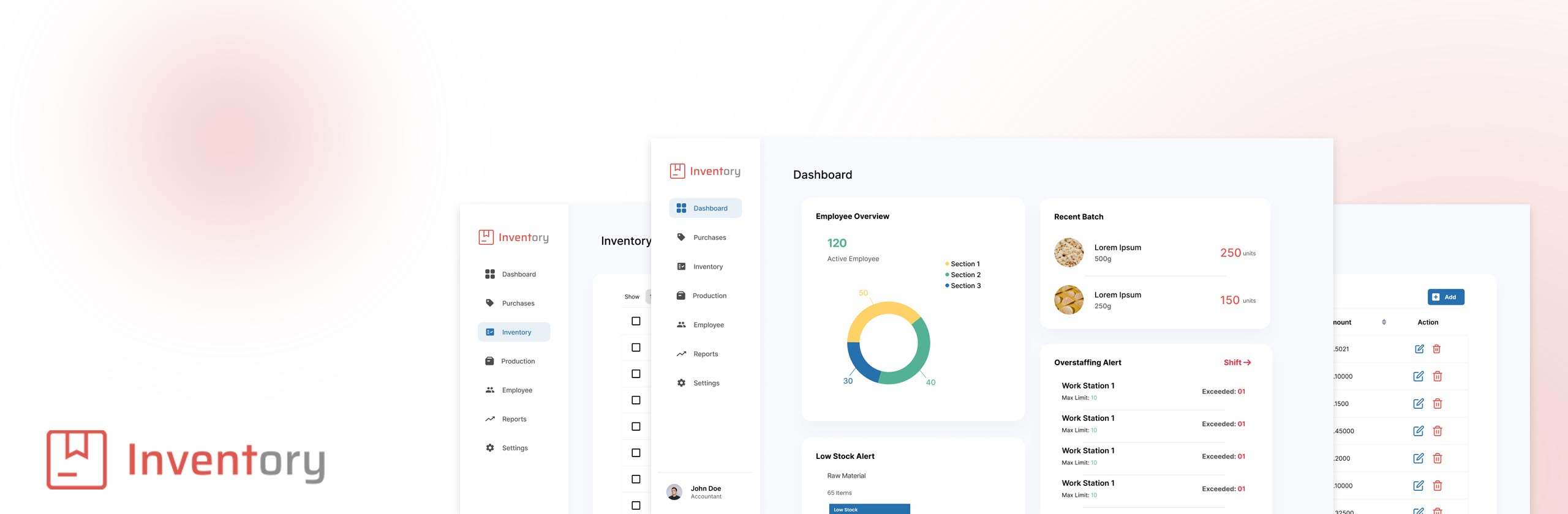
The 'Glance' Dashboard
A modular home screen that immediately surfaces the top 5 urgent actions needed across the factory.
One-Tap Logging
A quick-action drawer that pulls up from the bottom of the screen, allowing users to log stock changes without leaving the current view.
Usability Testing
Usability Testing & Iteration
We conducted moderated usability tests with 5 warehouse managers. They were asked to log a new shipment of raw materials and check the status of 'Batch 4A'.
What Failed
While logging materials was 60% faster, users struggled to read the 'Batch Status' table. The rows were too dense for quick scanning on a tablet.
The Iteration
We increased the row height by 24px, added alternating zebra-striping for contrast, and replaced text-based statuses with distinct recognizable icons.
Outcomes & Takeaways
Measurable Business Impact
The new dashboard system was rolled out across the main production facility over two weeks.
40% reduction in daily inventory processing time.
Inventory discrepancy errors dropped from 25% down to 3%.
New employee onboarding for the system reduced from 3 days to exactly 4 hours.
Key Takeaways
"This project reinforced that enterprise software shouldn't look boring—it should look clear. By designing for the specific physical environment (a brightly lit factory floor with tablets), we solved the actual user problems rather than just making a prettier spreadsheet."
© 2026 Shihab Saleem. All rights reserved.